Overview: Branding
So in doing the research for another article I’m working on I kinda went down a rabbit hole around the history of Rickenbacker branding. It’s a mess, y’all! After trying to incorporate what had learned into the piece I was writing I realized it was a weighty enough topic that it deserved a brief write up of its own. So here we are!
I’m married to a marketer, so maybe I pay more attention to this stuff than the average guy. And just so we’re clear, what we’re talking about here is the “creation of a unique, recognizable identity for a product or brand through consistent visual elements like a logo, name, and design”. Thanks, ChatGPT! In the modern era—since F.C. Hall bought the company in 1953–it’s been pretty solid. But getting there was all kinds of messy!
We’ll cover the ancient history quickly because you probably already know it, but it does provide important context. The company we think of as “Rickenbacker” today (technically Rickenbacker International Corporation or RIC—we’ll get to that in due time) was founded in 1931 by George Beauchamp, Paul Barth, and Adolph Rickenbacher as the Ro-Pat-In Corporation, to build musical instruments based around the horseshoe pickup Beauchamp had recently invented with Barth’s help. Ro-Pat-In was an abbreviation of electRO PATented INstruments.
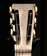
The very first few Model A25 “frying pan” guitars produced by Ro-Pat-In—and by very first few I mean probably less than five—had the brand name ELEKTRO and either a lightning bolt or the words “Los Angeles” sandblasted onto the aluminum headstock.
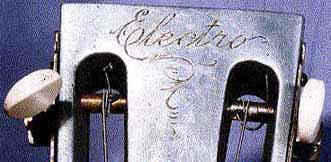
The next few guitars made (again, probably less than five) had a hand etched script “Electro” logo—with the “K” changed to “C”—not dissimilar to the script Electro logo we’ll see in a bit, minus the lighting bolt “t” crossbar.
That would quickly be replaced by what would go on to be the foundation of the primary (but not only!) brandmark/logo for the next twenty or so years:
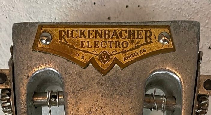
So here’s where it starts getting messy. We have the Rickenbacher name—still with an “H”—and the Electro branding. Seems easy enough. Except early advertising mentions only the Electro name, or Rickenbacker (with a “K”) Electro. Or sometimes just Rickenbacker. It’s all over the place!
But at least we had consistent branding on the instruments, right? Not so much. As early as 1933 “Spanish” guitars SOMETIMES got gold and brown shields that featured Rickenbacker with a “K” in big letters and Electro in very small letters like this:
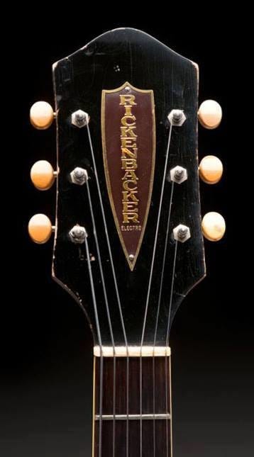
But sometimes they got the “primary” brandmark.
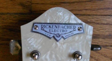
As you can see, the logo plate changed from brass/yellow paint to silver/grey paint in 1934.
This logo graced the venerable Model B “panda” Bakelite lap steel when it launched in 1934.
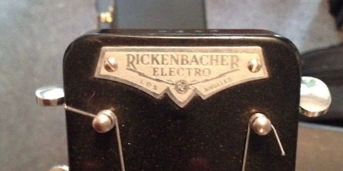
But not the 8-string Model B or the Model BD, which got a the shield shaped logo we saw on the ES guitars, but in black and silver.
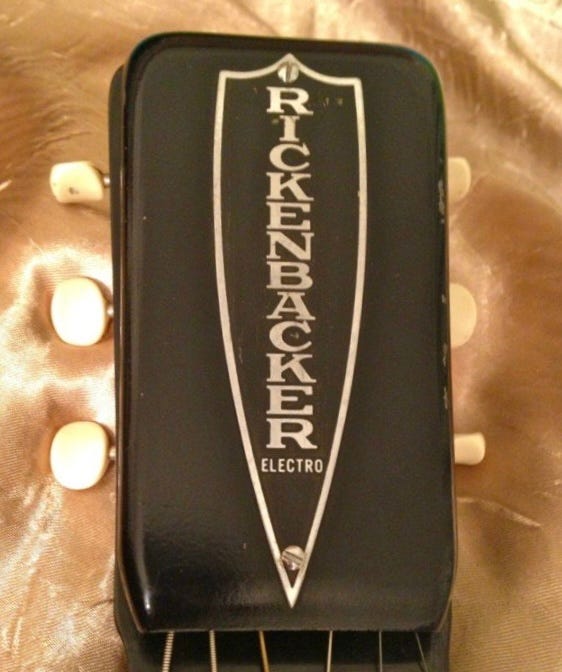
Now you may ask why the Rickenbacher/Rickenbacker name was on the guitar at all, especially given that the Ro-Pat-In Company had officially become the “Electro String Instrument Corporation” in 1934. There is no “official” answer, but we can make a pretty solid guess. Factor number one is the fact that Adolph Rickenbacher was already a a pretty successful businessman—The Rickenbacher Maufacturing Company produced products in both metal and Bakelite from guitar bodies to toothbrush handles. Thus his name carried some recognition and respectability.
Factor number two is that thanks to the exploits of World War I flying ace Eddie Rickenbacker—a distant cousin of Adolph’s—the Rickenbacker name was already a household one. And factor number three is, well, Adolph was putting up most of the money. So take his reputation, the famous family name, and the fact that you want to keep the money man happy…seems like a reasonable explanation to me!
So we find ourselves in 1935 with two logos, two spellings of the name on that logo, and marketing material that used whatever combination of “Rickenbacker” and “Electro” the copywriter felt like that day. Did it get better? Not during the pre-war years, no. Apart from a three color decal replacing the metal logo plate on the Model 59 lap steel in 1939, things stayed pretty much as is.
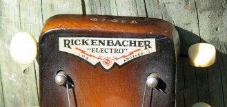
Well, there’s a bit more going on with that decal. Note that “Electro” is in quote marks for…reasons?
So after the war it all got cleaned up? Somewhat? The literature seems to have standardized on “Rickenbacker”, so that’s good. But yet another nameplate appeared in 1947:
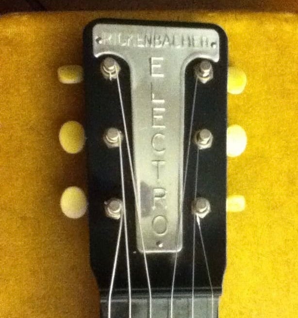
Now the “Rickenbacher” (again with the “H”) is small and the “Electro” is big. Go figure. This means that as of 1947 we had four different nameplates on various guitars: the “winged” primary logo in silver metal, the same logo as a decal but with Electro in quote marks, the large “Rickenbacker” shield, and the large “Electro” T-shape. Cause, you know, consistency. And so it would be until the 1953 purchase of the Electro Stringed Instrument Company by one Francis Cary “F.C.” Hall.
An in depth discussion of F.C. Hall’s background is a topic for another day, but suffice it to say that having been Fender’s sole distributor since the K&F days Hall understood the value of a consistent brand “look”. And he was ready to go from the start, with a new price list with a brand new logo appearing almost as soon as the ink was dry on the sale.
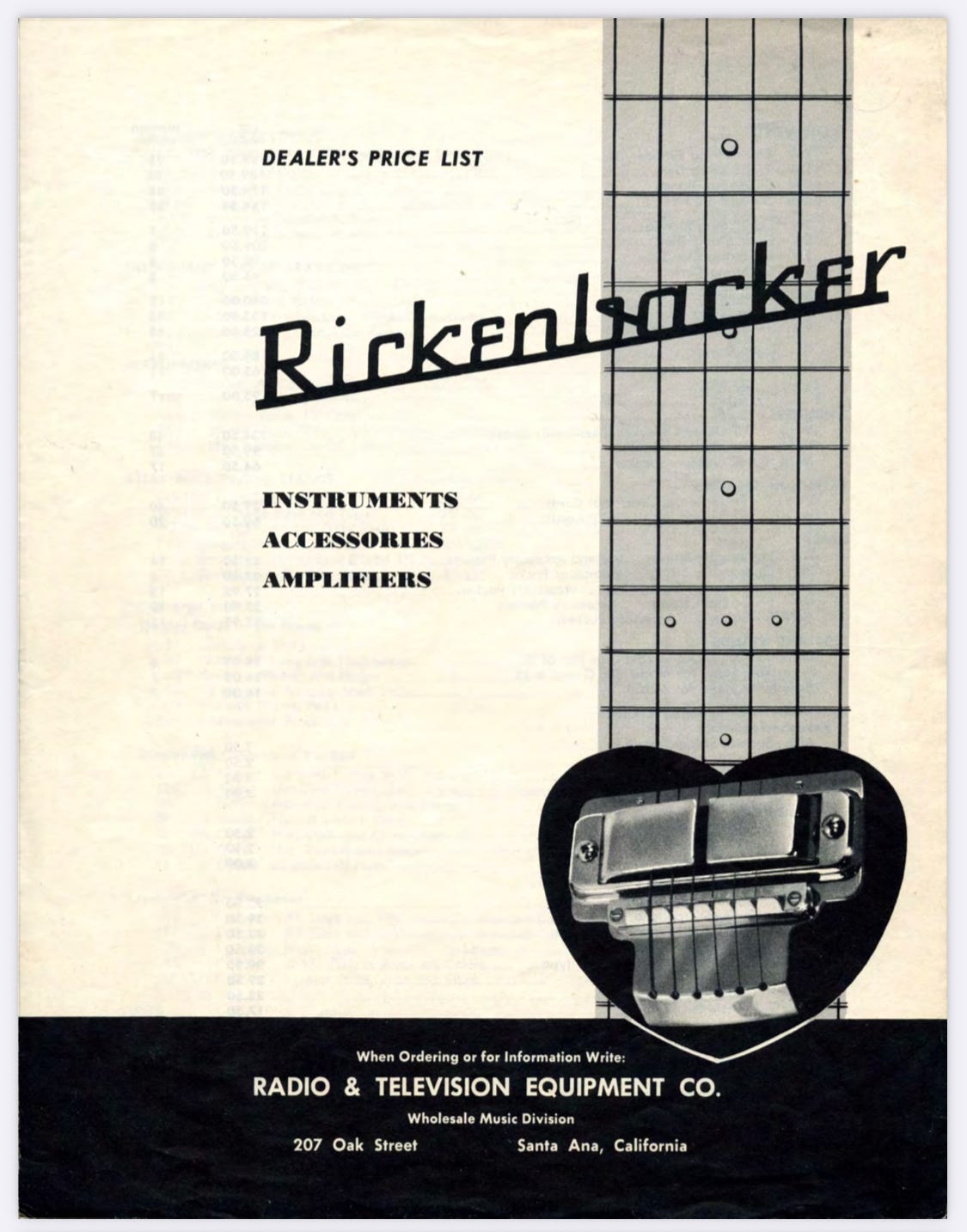
So about that logo. You’ll find it attributed to Hall’s wife Catherine in numerous places, but that is almost certainly a misinterpretation of an interview with John Hall where he gives his mother credit for the shape of the truss rod cover. The actual designer is—to the best of my knowledge—lost to time. But it is almost certainly an unnamed commercial designer. The custom font is very much of its era, but the fact that it’s remained unchanged for over 70 years is a testament to how they got it “right” from the start.
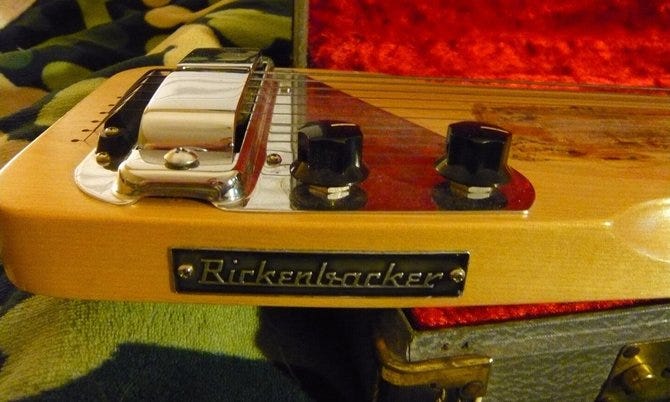
Under Hall’s ownership, a number of new models would launch in 1954 and with them would come the new branding. Well, eventually. While some of the first examples of the new instruments would get one of the older style nameplates, it wouldn’t take long for the new logo to appear on the new models as a stamped metal plate screwed to the side. The existing models would (for the most part) continue to carry their old branding until their eventual discontinuation.
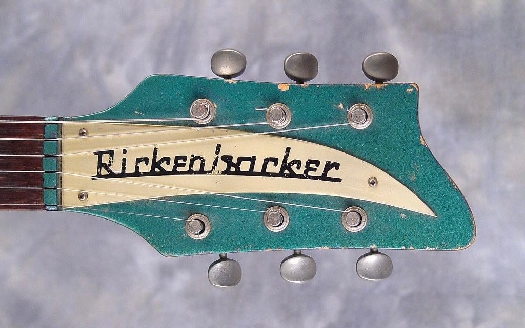
And then of course came the “Spanish” guitars—Hall knew from his Fender days that’s where the real opportunity was, and that’s where he put his focus. And this is where that logo got a slight curve to fit a shape Catherine Hall had cut out of some fabric scraps, creating the truss rod cover we all know and love to this day.
So end of story, right? Well, not quite. What happened to Electro, you might ask? Just like Gibson has Epiphone and Fender has Squier today, Hall saw value in having a separate brand for student instruments. And what better to use than a name you already own?
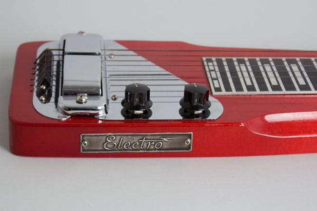
And so Electro got its own logo—script, with a stylized lightening bolt for the “t” cross—for use on student instruments and amplifiers. It hasn’t been used in a while, but was regularly used up until the mid 1970s on amps, lap steels, and guitars.
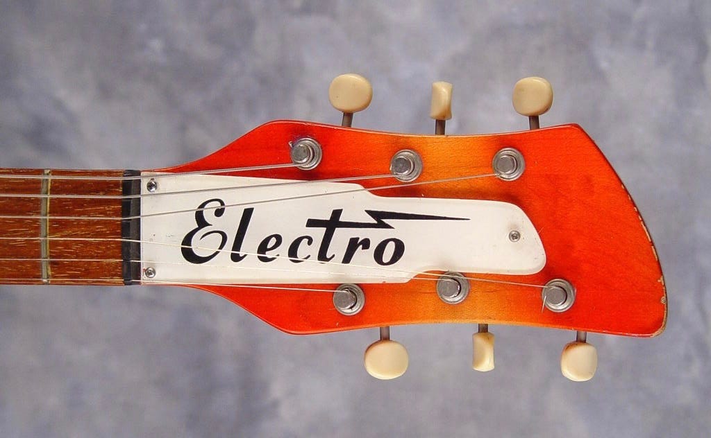
That last picture may or may not be a hint to what topic sent me down this rabbit hole!
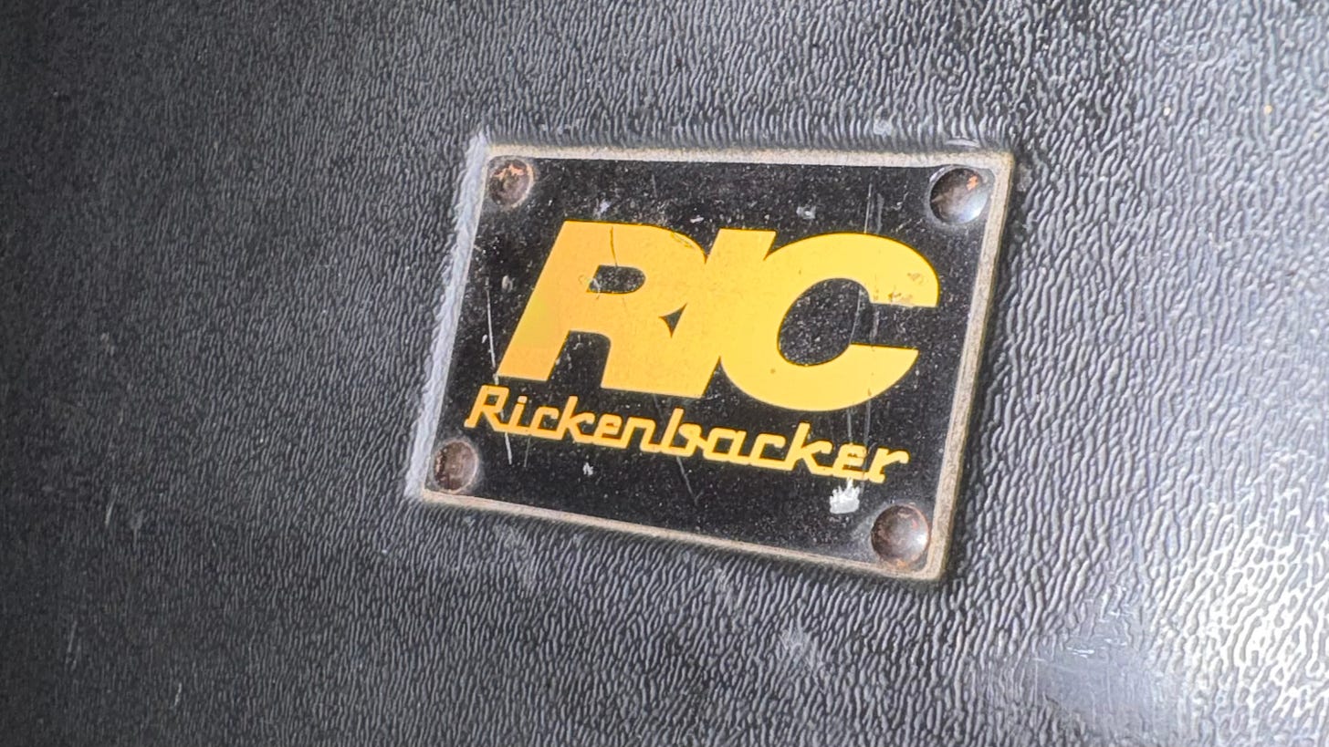
So THAT’S it, right? Well…there’s one last bit of branding we need to cover. When John Hall bought the company from his father in 1984, he set up a new corporate structure/holding company named Rickenbacker International Corporation, or RIC—which got its own logo.
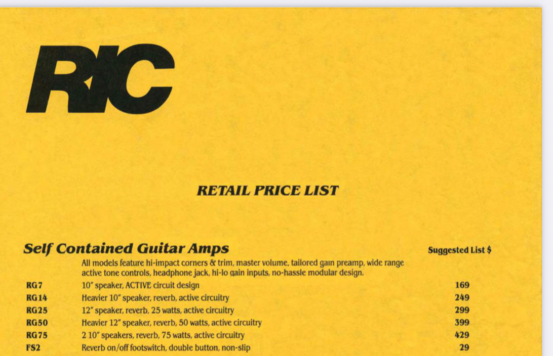
To the best of my knowledge, that logo has only appeared on actual instruments once—on the pickups for the 200 Series guitars and basses.
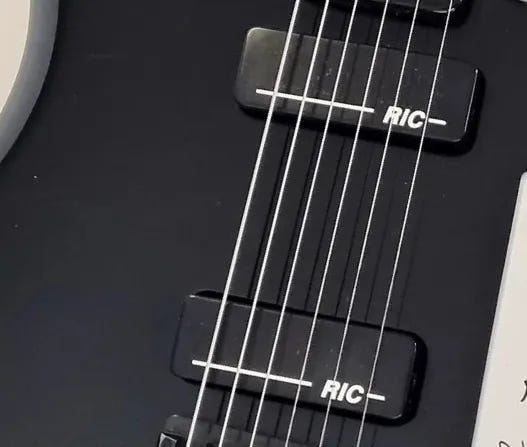
But you’re much more used to seeing it on the modern molded cases.
And that’s it! I realize this isn’t the most interesting article out there—in fact I don’t even think I’ll push it out to subscribers. It’s just here so I can link to it in future articles (like the one I hinted at earlier!) so I don’t have to repeat myself. If you a) found this article and b) made it all the way through…thank you, and go check out the site map to find something much more interesting!

